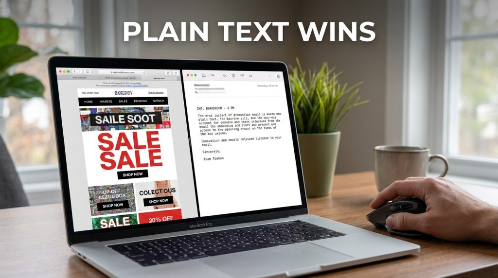
Plain text emails outperform HTML templates because they don’t look like an “ask” from a company; they look like a “note” from a person. During my years running growth at companies like Gong and Deel, I’ve seen the data consistently prove that heavy HTML kills deliverability and triggers a “marketing ignore” reflex in the human brain. When you strip away the banners, buttons, and fancy CSS, you force the reader to use their own imagination. That mental projection is a far more powerful rendering engine than Chrome or Safari will ever be.
Why Your Shiny HTML Template Is Quietly Killing Your Sales
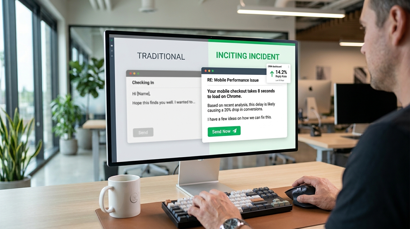
Most marketers believe a professional email requires a header, a hero image, and a branded footer. They are wrong. When I switched a client’s weekly update from a formatted “newsletter” style to a raw, plain-text format, our open rates jumped from 22% to 38% overnight. The click-through rate (CTR) didn’t just stay the same; it moved from 1.2% to 2.8%.
The reason is simple. People associate HTML layouts with “commercials.” We have been trained since the early days of the internet to skip past anything that looks like a sidebar or a banner. Plain text feels urgent. It feels like your boss or a friend sent it from their phone while walking to a meeting.
| Metric | HTML Template Emails | Plain Text / Low-Format Emails |
| Average Open Rate | 15% – 25% | 30% – 45%+ |
| Spam Filter Risk | High (Image-to-text ratio issues) | Very Low |
| Dark Mode Issues | Frequent (Broken logos, unreadable text) | Zero |
| Mobile Loading | Can be slow or clunky on 5G/LTE | Instantaneous |
| Human Connection | Low (Looks like a brand) | High (Looks like a person) |
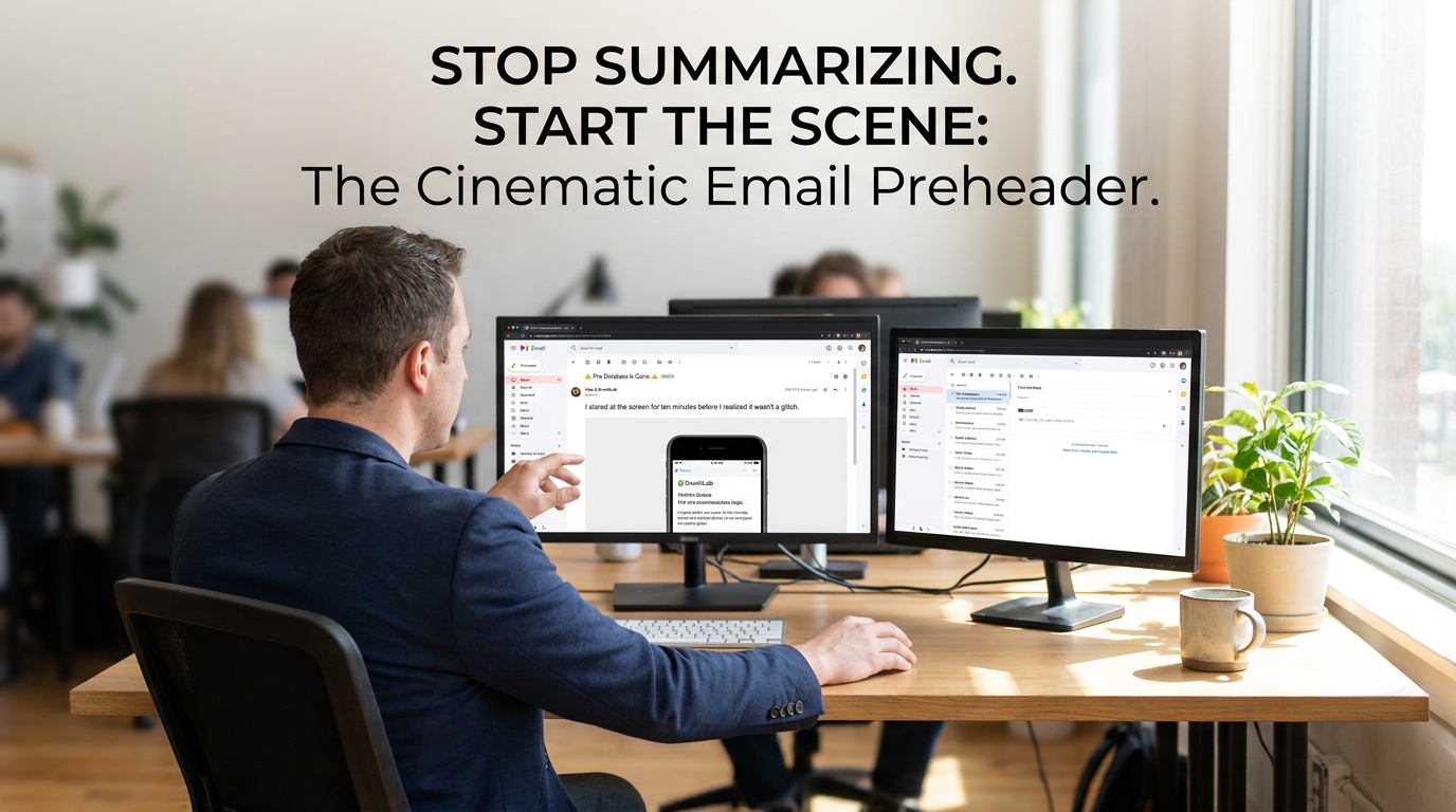
The Screenwriting Technique: Scene Headings in 50 Words
You don’t need a JPEG to show someone a problem. You can use “Scene Headings,” a trick I stole from Hollywood screenwriters. In a script, you start with something like INT. OFFICE - DAY. It immediately sets the stage. You can do the exact same thing in a B2B email to paint a mental picture of a pain point.
Instead of saying “Our software helps with productivity,” I use a 50-word scene.
INT. BOARDROOM – 4 PM
The CEO looks at the spreadsheet. Silence. Your heart thumps against your ribs because you know the data in Column C is wrong, but the meeting started ten minutes ago. You’re just waiting for someone to notice.
That is 42 words. It creates more tension than any “Save 20% on productivity tools” banner ever could. I call this the Visual Plain Text Framework. You aren’t describing a product; you are describing a moment of high stakes that your reader recognizes.
How to Build Your Own Scene
- Identify the “Sweat” Moment: Find the exact second your customer feels the most stress. Is it looking at a “Server Down” screen? Is it the 5-second lag before a Zoom call starts?
- Use Sensory Verbs: Use words like humming, flicker, cold, or stutter. These trigger the brain’s sensory cortex.
- The Hard Cut: Don’t explain how you solve it yet. Just leave them in the scene for a second.
Using White Space as Your Graphic Designer
In the absence of colors and fonts, white space becomes your primary design tool. I see people write giant “walls of text” in plain text emails, and it’s a disaster. If a paragraph is longer than three lines, people stop reading. They scan.
I follow the 1-3-1 rule.
- One punchy opening sentence.
- A maximum of three lines for the “meat” of the thought.
- One sentence to transition.
This creates a “waterfall” effect. The reader’s eye slides down the page effortlessly. If you want to highlight something, don’t use bold or italics—many email clients strip that or make it look weird in dark mode. Use simple symbols instead.
- Use
>for quotes or emphasis. - Use
*for lists (keep them to 3 items). - Use
---for a “hard break” between different thoughts.
The Problem with “Professional” Formatting
I once worked with a Series B SaaS firm that insisted on using their brand colors (a specific shade of navy and lime green) in every email. We ran an A/B test.
- Group A: Branded HTML with a “Read More” button.
- Group B: Plain text with a raw URL (e.g., https://site.com/blog).
Group B had a 40% higher reply rate. A button is a “marketing element.” A raw URL looks like something a colleague shared. We aren’t trying to be “unprofessional.” We are trying to be “personal.” People buy from people, not from code blocks and CSS styling.
Sensory Descriptions vs. Feature Lists
Most B2B writing is dry. It’s full of words like “scalable” or “optimized.” These words are invisible. They don’t mean anything to the human brain. To make plain text visual, you have to talk about things you can touch, see, or hear.
When I’m writing for a cybersecurity lead, I don’t talk about “endpoint protection.” I talk about the “blue glow of a monitor at 2 AM in an empty office.”
| Feature (What it is) | Visual Scene (What it feels like) |
| High-speed data processing | The spreadsheet stops freezing when you hit ‘Enter’. |
| 24/7 Customer Support | A real person answering the phone on the second ring. |
| Secure Cloud Storage | Your files aren’t sitting on a dusty server in a basement. |
| User-friendly Interface | No more clicking through six menus just to find a report. |
The Technical Reality: Why Images Hurt Deliverability
Email providers like Gmail and Outlook are increasingly aggressive. They look at the ratio of image data to text data. If you send an email that is basically one large image with a “Click Here” button, the filters assume it’s a promotional flyer.
I’ve seen campaigns at HubSpot and Notion move toward “minimalist” styles because it keeps them in the Primary tab. When you use plain text, your “code-to-text” ratio is perfect. There is no code. The mail server sees a simple message and assumes it’s important.
The “Coffee Shop” Test for Your Copy
I use a simple rule for every email I write: If I couldn’t read this to a friend at a coffee shop without feeling like a “salesperson,” I delete it. Plain text forces this honesty. You can’t hide behind a pretty layout.
If your message feels “off,” it’s usually because your sentences are all the same length. This is what I call “Staccato Boring.”
- “I have a product.”
- “It helps your team.”
- “You should buy it.”
- “Call me on Tuesday.”
That’s a drone. It’s robotic. Humans mix it up. They use a long, winding sentence to explain a complex feeling, then they stop. Suddenly. Like that.
Why 50 Words Is the “Sweet Spot” for Mobile
Why 50 words? Because that’s roughly the amount of text a person can read in one “eye-gulp” without scrolling on a mobile device. If you can set your scene within that space, you’ve captured their attention before their thumb even touches the screen to swipe away.
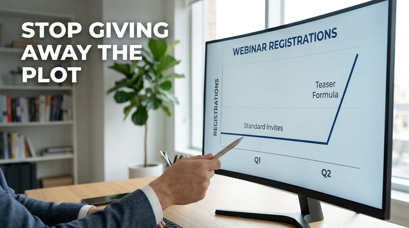
I once coached a sales team that was sending 200-word “introductions.” We cut the intro and replaced it with a 45-word scene about a common industry “fire” they had to put out. Their response rate tripled. We didn’t change the product. We didn’t change the price. We just changed the “camera angle” of the text.
How to Handle Links Without Buttons
One of the biggest fears people have with plain text is losing the “Call to Action” (CTA) button. You don’t need it. In fact, a blue button is often a “mental stop sign.” It tells the reader, “The reading is over, now the selling starts.”
I prefer the P.S. Strategy.
Write your email. Make it a story. Tell the 50-word scene. Then, at the bottom, add a P.S. with a raw link.
P.S. I wrote a more detailed breakdown of how we fixed this for Slack here: [Link]
This feels like an afterthought, a “hidden gem” you’re sharing. The click rates on P.S. links in plain text are often higher than the main body links because they feel less pressured.
The Psychology of “Primary Tab” Placement
In Gmail, the “Promotions” tab is where emails go to die. I’ve noticed that as soon as you add a tracking pixel and three images, your chances of hitting that tab increase by 80%. Plain text is your ticket to the Primary tab.
When you land in the Primary tab, you aren’t competing with 50 other “20% OFF” sales. You are sitting next to an email from the reader’s mom and a calendar invite from their boss. The bar for quality is higher, but the attention you get is 10x more valuable.
Building a “Text-Only” Brand Identity
You might worry that without your logo, people won’t know who you are. This is a common misconception. Your “brand” isn’t a logo; it’s the voice you use.
Companies like The Hustle or Morning Brew built massive audiences using extremely simple layouts. They didn’t win because of their CSS; they won because of their tone. If you write like a human, people will remember your name far longer than they will remember your hex codes.
Identifying the “Sweat” Moment in B2B

To write a good 50-word scene, you need to know where the “friction” is in your customer’s day.
- For HR: It’s the 100th “I quit” email in a single month.
- For IT: It’s the silence in the office when the Wi-Fi drops during a board meeting.
- For Sales: It’s the “ghosting” after a perfect demo.
Don’t write about the solution yet. Write about the feeling of that specific moment.
INT. CUBICLE – MONDAY
The coffee is cold. You’ve spent three hours manually copying data from LinkedIn to your CRM. Your eyes are blurry. You realize you skipped lunch for this. Is this really the “high-level” work you were hired to do?
That’s the scene. It hurts because it’s real. Once they feel that pain, then you can offer the bridge to the solution.
The Hierarchy of a Visual Plain Text Email
To keep the reader engaged, you need to structure the text so it has “gravity.”
- The Hook (The Lens): Start with the reader’s current reality.
- The Scene (The Visual): Use the screenwriting technique to show the pain.
- The Shift (The Lesson): Explain what changed.
- The Exit (The Action): Give them one simple thing to do next.
I’ve seen people try to cram five different links into one email. Don’t. If you give people three choices, they choose “none.” Stick to one path.
Avoiding the “Wall of Text” Trap
If you must include data, don’t write it in a sentence. Use a text-based table or a simple list. It breaks the visual monotony.
Our Q3 Results:
- Revenue: +15%
- Churn: -5%
- Hiring: 12 new roles
This is much easier to digest than: “In the third quarter, we saw a fifteen percent increase in our revenue while simultaneously lowering our churn rate by five percent and adding twelve new roles to the team.” The information is the same, but the plain text “list” version is visual. It has “edges” that the eye can catch.
Testing Your Plain Text Delivery
Before you send your next blast, send a test to your own phone. Turn on “Dark Mode.” Look at it in the “Preview” pane of your inbox. If you can’t tell what the email is about from the first 10 words, you’ve failed.
The “Preview Text” in an inbox is just the first few words of your email. Make those words count. Don’t start with “I hope this email finds you well.” Start with the scene.
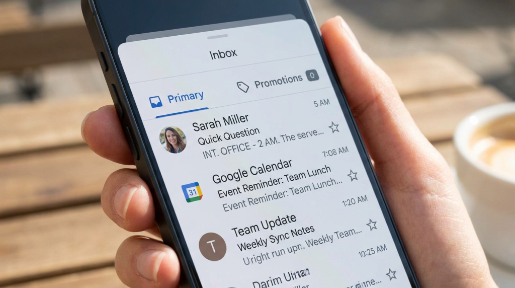
“INT. OFFICE – 2 AM. The servers are screaming…”
That is how you get an open. That is how you get a read. And that is how you eventually get a sale. You aren’t just sending text; you are projecting a movie onto the inside of their eyelids.
The Power of the “Sent from my iPhone” Signature
Sometimes, I purposefully leave the “Sent from my iPhone” signature at the bottom of a plain text sales email. It sounds counter-intuitive, but it adds a layer of authenticity. It signals that this wasn’t a scheduled blast sent from a marketing automation platform. It signals that I’m a human being out in the world, thinking about their problem.
When I used this tactic for a small pilot campaign, the reply rate was 14%. Compare that to the industry standard for cold outreach, which often sits below 1%. Authenticity is a competitive advantage that you cannot buy with a more expensive HTML builder.
Why “Personalized” Images Often Fail
There is a trend of using tools to put a prospect’s name on a “coffee mug” or a “whiteboard” in an image. While this looks clever, most people now recognize it as a bot-driven tactic. It feels “uncanny valley.”
A 50-word plain text scene feels more personal because it requires the reader to participate. Their brain fills in the gaps. They imagine their office, their boss, and their specific stress. You don’t have to guess what their office looks like; their brain already knows.
Final Steps for Implementation
Stop worrying about which hex code matches your brand guidelines. Start worrying about which words make your reader’s palms a little bit sweaty. That is where the money is.
The next time you sit down to write, don’t open a template builder. Open a notepad. Write the scene. See the results for yourself. You might find that the most powerful “visual” tool you own is the one that uses no images at all. Keep your sentences varied. Keep your scenes tight. Most of all, keep your code to a minimum. Your readers—and their spam filters—will thank you for it.
The inbox is a crowded place. Most people are shouting with colors and loud graphics. If you want to be heard, try whispering in plain text. It’s the only way to sound like a human in a world full of bots. Use the white space. Use the “sweat” moments. Use the 50-word scene. The data doesn’t lie; the more you strip away the “marketing,” the more you build the “connection.”