About a year ago, I was scrolling Instagram at midnight. Again. I had already scrolled for 40 minutes. I was not enjoying it. I was not learning anything. I was just… scrolling. Moving my thumb up, pausing on a video for a few seconds, moving on. My eyes were tired, my brain was numb, and I could not stop.
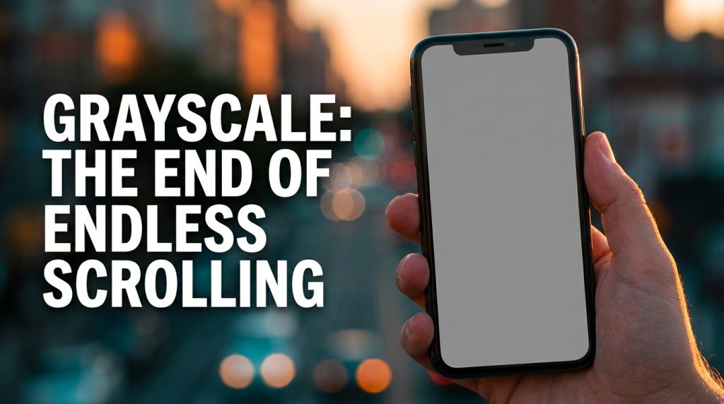
The next morning, I switched my phone to grayscale — the setting that removes all color and turns your screen into a black-and-white display. I had read about it as a “screen time reduction hack” and was skeptical enough to try it as an experiment rather than a commitment. I told myself I would give it one week.
It has been twelve months. My phone is still in grayscale. My average daily screen time dropped by roughly 35 minutes per day. And the change is not because I am more disciplined — it is because a black-and-white phone is genuinely boring to scroll through.
How Color Manipulation Keeps You Scrolling
This is not a conspiracy theory — it is standard interface design. App designers use color deliberately to attract and retain your attention. Notification badges are red because red signals urgency. Social media feeds use vibrant images because visual contrast triggers dopamine-driven curiosity. Buttons, icons, and alerts are colored to draw your eye to specific actions.
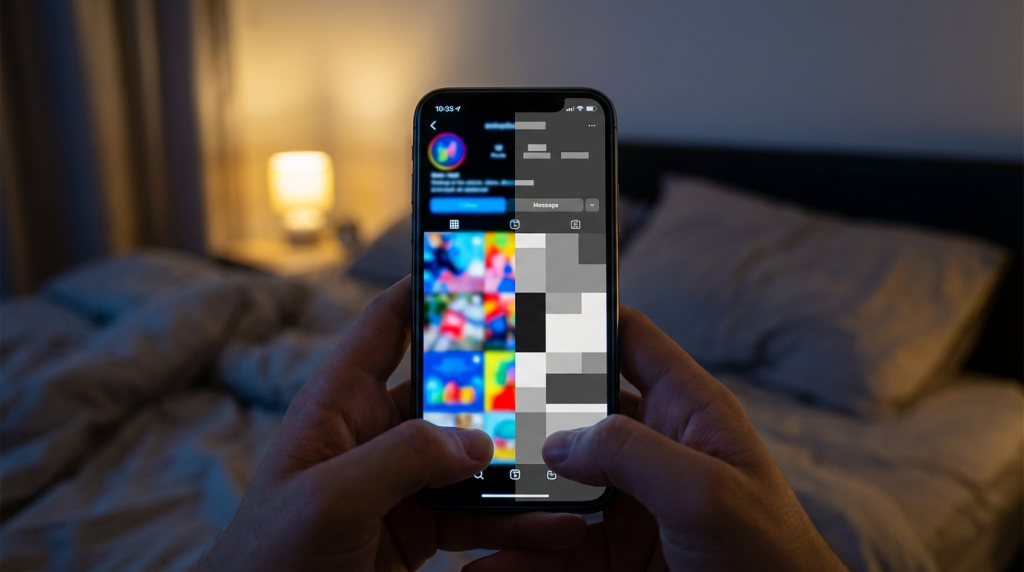
When you remove color, you strip away these visual triggers. Instagram in grayscale looks like a newspaper from 1950. A notification badge in gray is far less compelling than a notification badge in red. The phone stops being a slot machine and starts being a tool.
| Design Element | In Color | In Grayscale |
| Notification badges | Bright red — triggers urgency, demands attention | Gray dot — noticeable but not emotionally activating |
| Social media feeds | Vibrant, contrast-rich — designed to hold your gaze | Flat, monotone — visually uninteresting |
| App icons | Colorful, branded — designed for recognition and impulse taps | Gray blobs — harder to locate quickly, which slows impulse opens |
| Photo/video content | Saturated, vivid — maximizes visual reward | Muted, dull — reduced dopamine response |
How to Enable Grayscale on Your Phone
On iPhone (iOS)
- Go to Settings > Accessibility > Display & Text Size > Color Filters.
- Toggle on Color Filters and select Grayscale.
- Optional: Set up an Accessibility Shortcut (Settings > Accessibility > Accessibility Shortcut > Color Filters) so you can triple-click the side button to toggle grayscale on and off quickly when you need to view something in color.
On Android
- Go to Settings > Digital Wellbeing > Bedtime Mode. Enable it and select Grayscale. You can schedule it for specific hours.
- Alternatively: Settings > Accessibility > Color Correction > Grayscale (varies by manufacturer).
- Some Android phones allow Quick Settings tiles for grayscale toggle.
My Experience: What the First Week Was Like
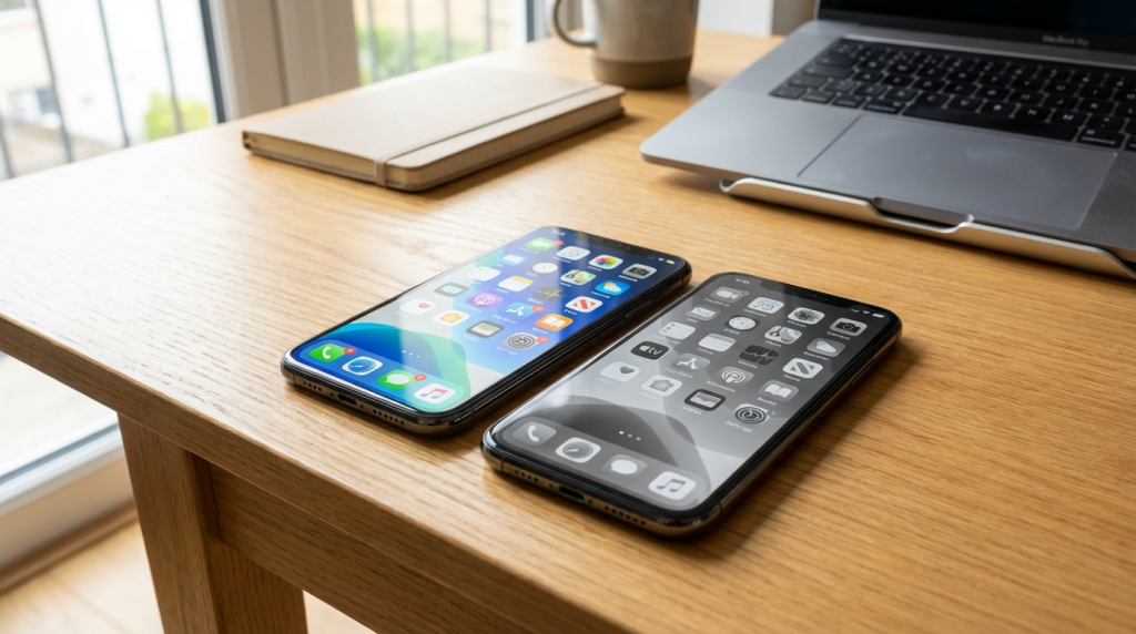
Day one was jarring. Your phone looks broken. Everything feels slightly wrong. Photos look like they are from 1960. Maps are harder to read. Games are unplayable.
Day two, I started adapting. I noticed I was picking up my phone less frequently because the visual reward of looking at it was gone. My normal pattern was to pick up the phone, open an app, scroll for a few minutes, and put it down. In grayscale, the scroll-and-browse loop broke after about 30 seconds instead of 10 minutes, because nothing was visually stimulating enough to hold my attention.
By day five, the urge to check my phone had dropped noticeably. I was picking it up with purpose — to check a message, make a call, look something up — and then putting it down immediately. The idle scrolling had reduced by roughly 70%.

The Data: My Screen Time Before and After
| App Category | Daily Average (Color) | Daily Average (Grayscale) | Change |
| Social media | 62 minutes | 25 minutes | -60% |
| News/browsing | 38 minutes | 20 minutes | -47% |
| Messaging | 30 minutes | 28 minutes | Minimal change (text-based, not visually driven) |
| Utility (maps, calendar, weather) | 15 minutes | 14 minutes | No meaningful change |
| Total screen time | 3 hours 25 min | 2 hours 47 min | -35 minutes per day |
The biggest drops were in visually driven apps — social media and news browsing. Text-based apps like messaging and utility apps showed almost no change, which makes sense. Grayscale reduces the appeal of visual content, not text-based interactions.
When Grayscale Gets in the Way
I will not pretend there are no downsides. There are situations where you genuinely need color:
- Photo editing or viewing photos people sent you — everything looks off in grayscale.
- Maps and navigation — color-coded transit lines and route distinctions are harder to read.
- Shopping apps — when you actually need to see what a product looks like.
- Identifying things — when something is color-coded (charts, health indicators, status lights).
For these situations, I use the triple-click shortcut on iPhone to toggle back to color temporarily. It takes one second. I view what I need in color, then toggle back to grayscale. The toggle itself acts as a speed bump — it requires a deliberate action to switch, which prevents casual drift back into color mode.
Is This a Permanent Fix?
Honest answer: for some people, the novelty wears off. Research suggests that grayscale is most effective as a pattern interrupt — a way to break an existing scrolling habit. If you adapt to the gray and start scrolling again out of boredom-driven habit rather than color-driven reward, its effectiveness fades.
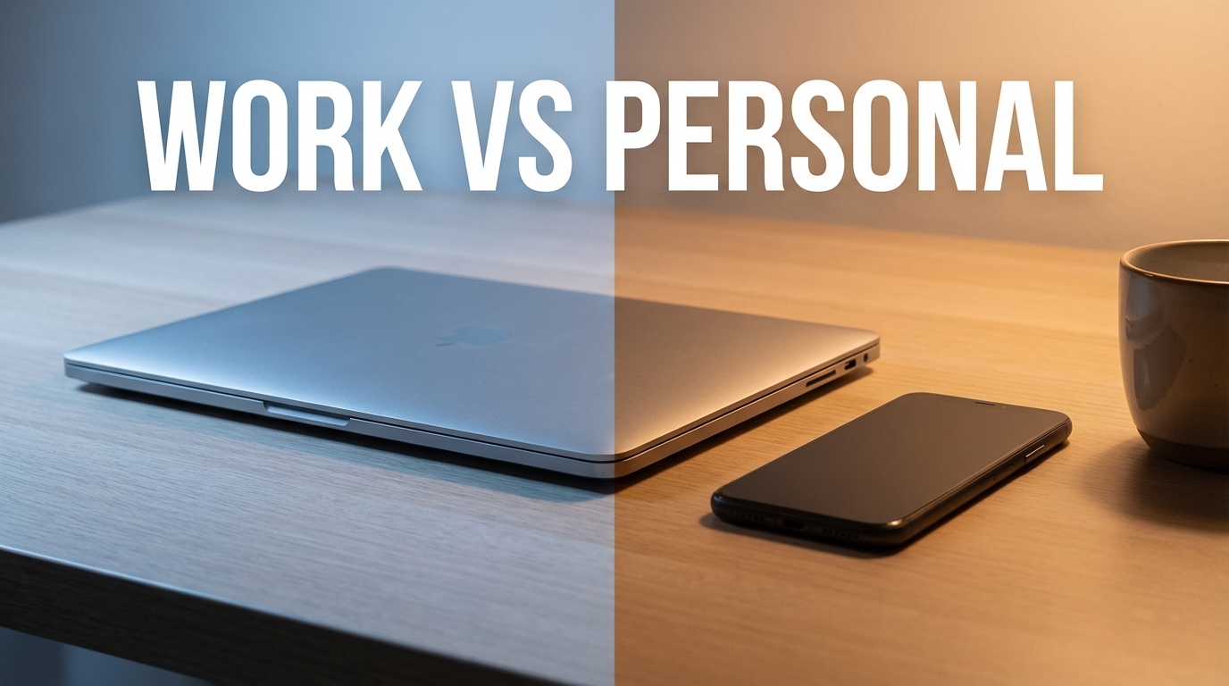
For me, it has held up for twelve months. But I also combined it with other changes: phone in a drawer during work, no work apps on my personal device, and a general intention to use the phone for tasks rather than entertainment. Grayscale alone might not be enough. Grayscale as part of a broader approach to screen habits is significantly more effective.
Worth Trying, Low Risk
Here is the thing: switching to grayscale takes 30 seconds, costs nothing, and is instantly reversible. There is no downside to trying it. If it does not reduce your screen time after a week, switch back. If it does, keep it.
But I will say this: after twelve months of a gray phone, switching back to color temporarily feels overwhelming. The screen looks like a carnival. Colors scream for attention. App icons practically pulse. It makes me acutely aware of how much visual manipulation is built into normal phone interfaces — manipulation I no longer notice because I removed it.
Try it for a week. You have nothing to lose except maybe 35 minutes of daily scrolling you were not enjoying anyway.